 "GhostZ" (GhostZ)
08/15/2013 at 14:02 • Filed to: Kinja Help
 2
2
 15
15
 "GhostZ" (GhostZ)
08/15/2013 at 14:02 • Filed to: Kinja Help |  2 2
|  15 15 |

Thank God it was changed. I like using all 1080p of my resolution. It's still buggy, but it's a lot more efficient packaging. Consider that you have access to about 20-30 stories, instantly, with a single click and a little scrolling, whereas before you could only see 3-4 stories at once before needing to scroll.
What people need to realize is that design trends such such as "infinite scroll" and "minimalist content" are no longer the vogue. That's because they were a reaction to cluster-fuck pages (read: ESPN, NBC, etc.) of the mid-2000s that were trying to maximize their info-per-page amount.
And THOSE were a reaction from thumbnail pages where the screen sizes (pre-HD) limited how much you could have, so each article had many pages and you'd have to navigate by links, since everyone's internet sucked back then. As time goes on, we pick up a little bit from each new trend and style and try to create the best webpage possible: all while new technology comes out that challenges those ideas, and market opinion sways based on other aesthetics.
Look at websites like !!!error: Indecipherable SUB-paragraph formatting!!! . Even with their minimalist approach, they're going for maximum content in one page, it's just trying to keep it looking clean that's the problem (Kinja still has some work to do in that department).
Look at cars in the last 3 years. They change slower than webpages, but the same trend is there. The clean lines and minimalism of the mid-2000s doesn't sell now in the early 2010s.
Rant short, it's about time we got past minimalism (note: "clean", or "simple" are not the same as "minimalist") and started using our absurd internet connections and massive resolution displays to actually get information more efficiently.
That being said.... Things I would like to see:
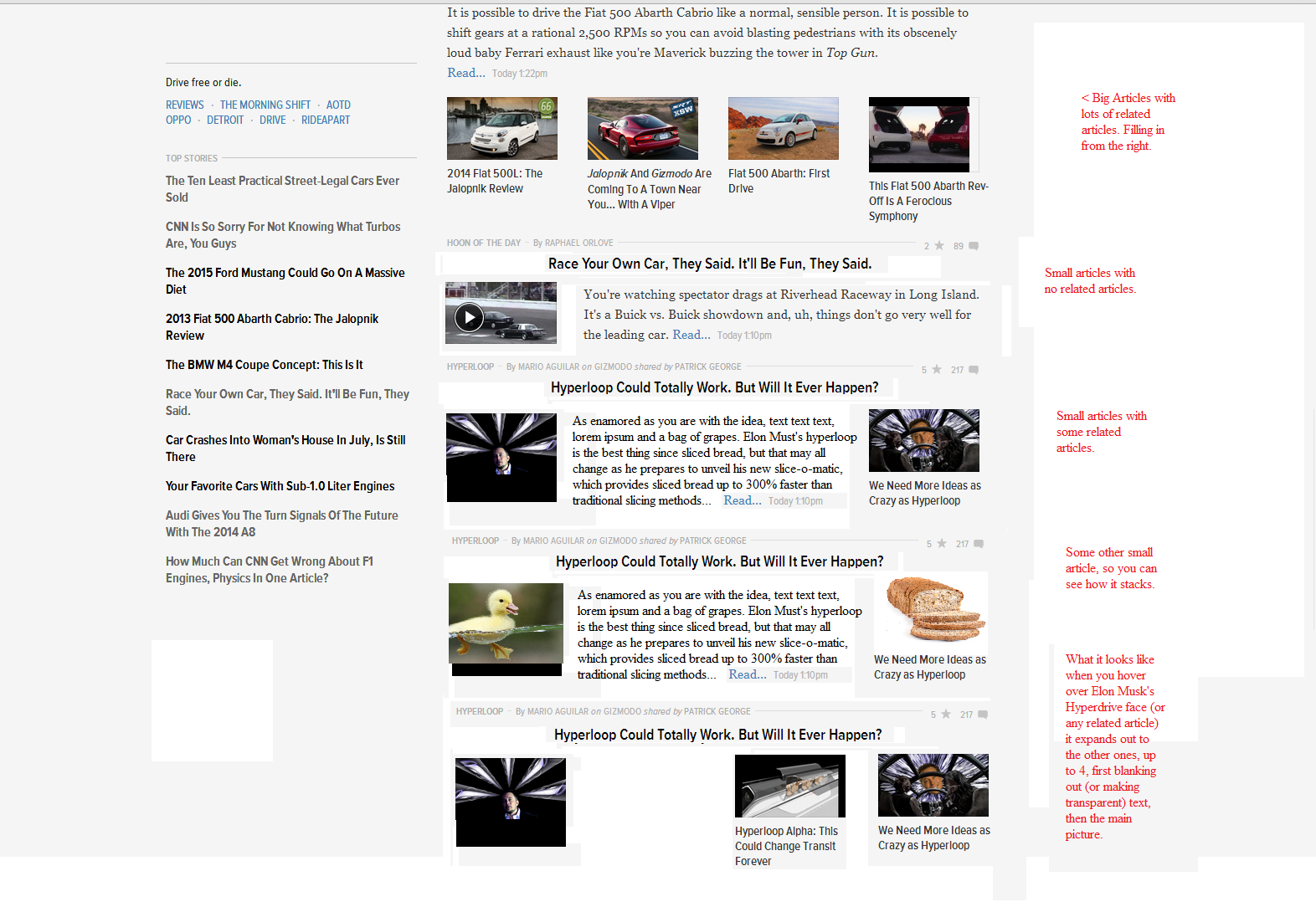
More differentiation between the related articles and the article image. In no article should the main image be the same size and in the same location (look at the Hyperloop article) as the related ones. The little bar that designations the difference is just simply too small to really be visible. I'd like to see a bit larger picture for main articles, and the related articles be a hover-over picture, that when you hover, expands out to the full list. That way when the length of the first paragraph, or the size of the picture, changes, it doesn't create awkward dead white space. The spacing needs to be consistent article-to-article so I don't have to think about which picture fits the actual article. Think Metro.
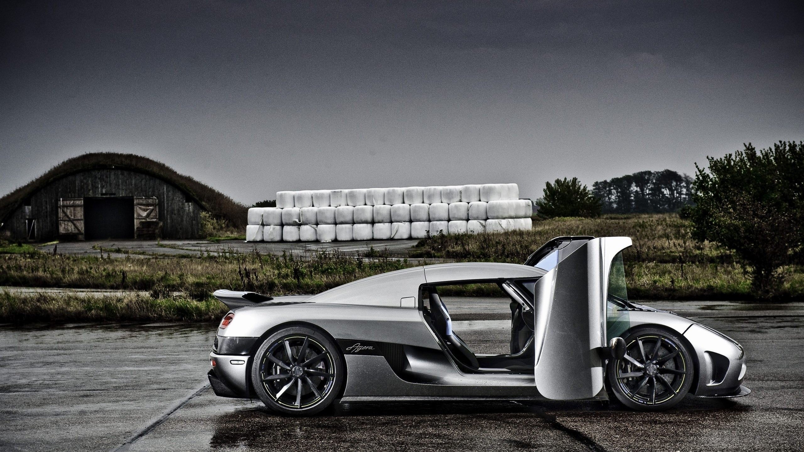
Also, Koenigsegg for your time.
 GRIVLET - Proud of Cobalt
> GhostZ
08/15/2013 at 14:09 |
|
I'm still using very little of my 2048x1152 (barely larger than 1080p)
Also, no me gusta.
 PanchoVilleneuve ST
> GhostZ
08/15/2013 at 14:09 |
|
I'm using all of my 1080p. And most of it is blank.
 DrivesaCorolla
> GhostZ
08/15/2013 at 14:10 |
|
Not a fan of losing the drop down menu at the top, to switch between gawker/jalopnik/gizmodo sites with ease.
 feather-throttle-not-hair
> GhostZ
08/15/2013 at 14:11 |
|
Brown noser!
But I'll give you a pass because I suspect we actually go back pretty far. Did you used to post a lot on My350Z.com?
 Gamecat235
> GhostZ
08/15/2013 at 14:15 |
|
Ogilvy and Mathers is not so much minimalist as they are efficiently using a simple palate and using their space well (IMO - and I realize that I'm splitting hairs).
I agree, mostly. And this was the type of feedback that deserves a standalone post instead of adding into my collection for general feedback. For the sake of letting the IT and other folks know that they are doing a good job, would you mind adding a "kinja help" tag? Trust me, positive comments will not be seen in a negative light with this tag.
There are some minor things to correct, and some questions that I'd like more answers to, but overall, it's nice.
 GhostZ
> Gamecat235
08/15/2013 at 14:18 |
|
Yeah, my point is that they aren't truly minimalist. It may have come across wrong in the rant. They're like (can't believe I'm typing this) post-minimalist.
I think the biggest problem in the last few iterations still remains the related articles. It's a tough question, since the number, amount of text, space needed, and "relatedness" of all the articles vary a lot.
 GhostZ
> feather-throttle-not-hair
08/15/2013 at 14:25 |
|
I wish, if that meant that I owned a 350z.
I must not be the Z-enthusiast you think I am. I get around the internet quite a bit, but that's one place I'm not on.
 Z_Stig
> DrivesaCorolla
08/15/2013 at 14:28 |
|
It's still there, just bundled with the notifications on the right hand side at the top
 DrivesaCorolla
> Z_Stig
08/15/2013 at 14:29 |
|
Aha! Thank you :)
Drop downs are too long for the laptop screen :/
 minardi
> GhostZ
08/15/2013 at 14:37 |
|
Hum, I may disagree on some of your comments regarding layout.
1. Once upon a time, the number of clicks counted (could not separate the click from the eyeballs)
2. A few years back, the only portion of a page seen by the search engine bots were the top of the page, thus putting alot of copy at the top in very small size face
3. Then you had metada, not anymore.
4. Now who knows the algorithm used since search engines keeps it secret
5. Now, user have 2-4 seconds attention before clicking elsewhere (you know, the choices offered) and I can assure you in that amount of time, nothing jump to my attention and invites me to read.
The window of a store should appeal to the potential customers and to see what the store has to offer and for the rep to make the sale. If every single product is in the window, and the customer see nothing of interest, he will walk away and never entered. See the analogy?
 Nick Denton
> GhostZ
08/15/2013 at 15:06 |
|
Glad you generally like it. And you expressed the design philosophy better than I could. Yeah, infinite scroll was a dead end.
Okay, here's a question for you: how do we differentiate the article thumb and the "relateds" without breaking the six column grid.
We tried slightly larger thumbs — and even double-width thumbs which were grid-conforming — but the page looked like a mess.
 GhostZ
> Nick Denton
08/15/2013 at 15:32 |
|
The way the fiat 500 article is done looks great, but not many articles are going to have a full sized image and 4 "related" images.
I would put the thumbnail for smaller articles on the left side of the column (column#1 of 4 in the scrolling section) Title above all 4 columns, and then reserve 1 column on the right (column #4) for related posts. When you hover over column #4 , it expands out and up to 4 related posts are shown overtop of the article text. That way we know immediately left side is article picture, right side is related articles, and if we want to view more related articles, just hover over. If there are no related articles, just extend the text space from columns #2 and #3 to include #4.
I don't know if the coding prevents that, however.
The M4 coupe concept post is basically what I"m thinking, except that for posts that do not need large images, the actual picture of the M4 is left on the left column.
So:
1-4 being related articles. T being small thumbnail.
Title
[BIG PIC]
[TEXT]
[1][2][3][4]
For small thumb:
Title
[T][TEXT][4]
And on hover for those small articles:
[1][2][3][4]
So it would look something like this:
[BIG PIC]
[TEXT]
[1][2][3][4]
——————- (title after the dashes, it doesn't take much space up)
[T][TEXT][4]
———————-
[T][TEXT][4]
———————
[BIG PIC]
[TEXT]
[1][2][3][4]
——————-
[1][2][3][4] < hovering over this one
——————-
That way the text is always centered, the related articles are still visible, and if we wanted to read more, it's right there without messing up formatting. The whole thing is a little flatter to.
I do see a problem with not having as many related articles immediately up front, and extending any farther to the right there would be a problem for low-res monitors, but this is just a thought.
 feather-throttle-not-hair
> GhostZ
08/15/2013 at 15:48 |
|
ahhh must be another Ghostz. Oh well, the internet is a big place.
 Nick Denton
> GhostZ
08/15/2013 at 15:54 |
|
Ach, please don't think me lazy. But I can't quite follow your text shorthand for design.
 GhostZ
> Nick Denton
08/15/2013 at 16:27 |
|
